Signage Best Practices: Boost Your ROI With These Three Simple Steps
We’ve been in the business for years, and we’re here to give you three tips to boost your ROI through the ancient and traditional art that is signage.
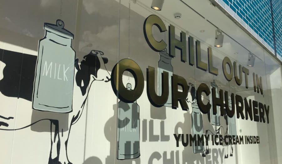
We’ve come a long way since the mural frescoes of Pompeii to indicate where fellow citizens might find a good time. With the advent of lightweight materials such as acrylics and the technological advancements of LEDs, solar-powered batteries, and our very own GDI TRAX system for discrete signage wiring solutions, the world of physical signage is every bit as versatile as digital signage.
The Importance Of Innovative Signage and Branding
The right signage practices will help to build brand recognition in the physical world – not everything happens online – and ultimately increase footfall and conversions, which will increase your ROI.
Linda Lombardi, Head of Global Store Design for Godiva, explains that ROI metrics govern every aspect of allocating budgets for store investment. This is often seen as a self-fulfilling prophecy: rich stores with ample signage budgets get richer, while the poor are starved of sufficient investment.
Well-managed companies increase store revenue by making calculated improvements based on increasing ROI in underperforming space. Improved signage solutions are an absolutely key part of that strategy.
So, to boost your ROI overall, keep these three best signage practice tips in mind.
3. Branding and Re-Branding
Most of our clients already have their branding and image in place when they approach us for business signage solutions, but if yours needs refreshing then now is the time to do it.
Signage is a necessary investment for all businesses and is intrinsically linked to branding. Design-oriented companies such as Buffalo Wild Wings and H&M collect extensive data on store performance and conduct surveys on customer satisfaction that include questions on brand recognition through signage. James Damian of Buffalo Wild Wings believes that stronger sign and building development practices lead to brand excellence and individual stores should be rewarded.
Branding is crucial to the success of any business, starting with looks. You need to have a clear idea of your market needs, your brand image, and the message you wish to communicate. A graphic designer can create a logo that will appeal to your target audience, but it’s important to have an end look and feel to aim for in your design so you can guide them.
This is especially important if you need substantial signage for sizeable premises. Do some research to identify the frequency and size guidelines your signage should meet. If a re-brand is in the works but is taking up time or being particularly costly, it may be worth investing in interim signage to ease the transition and moderate costs.
Whatever the situation of your business, your finished logo needs to be distinctive, easy to replicate and in line with your image and brand values.
2. Integrated Signage
Know what your audience will be doing.
When your audience sees your signage, will they be moving, touching it, sitting down, looking up, or waiting? Will they be looking at it for information, interaction or to fulfil a task (eg: for payment or selection purposes)?
Size matters. As does placement. Signage that is driven past in a split-second needs to be a different size to signage that announces the correct building.
Think of internal signage as well. Footfall and conversions happen inside buildings, so your branding and image should pervade the whole of your premises – especially for retail businesses.
In order to maximise the impact of your signage, think about how to integrate it with your brand and surroundings. If your brand has trendy values such as sustainability or high material quality like Fat Face, try integrating your signage with architectural and interior novelty to push the modernity of your brand.
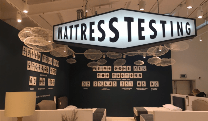
“If you want to see innovation in signs and brand design, observe how companies expend their resources in less conventional locations.”
Linda Lombardi, Head of Global Store Design for Godiva
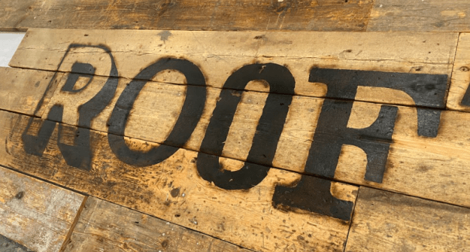
There is a perceptible shift in trend towards minimalism in design, with less being used to do and say more for your brand, but trendy values don’t have to mean a clean, minimalistic look: see the ‘reclaimed’ or ‘distressed’ wooden signs we produce for White Stuff, or the urban exposed neon for SuperDry.
In a recent project for the first flagship store of Loaf, an online furniture retailer, we produced signs that would alternately communicate luxurious comfort, invite customers to test mattresses in a secluded area, or appeal to young children with limited attention spans (bright colours and placed lower down the wall). The strategic placement of these signs was as carefully thought-out as the manufacturing process itself to maximise customer enjoyment and conversion probability.
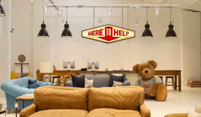
Creativity with signage integration is particularly important in a retail environment, where conversions are as likely to result from sensory stimulation, such as feel and taste, as from visual enjoyment.
Remember: signs don’t exist in a vacuum. One piece of random signage will get lost, so consider your signage as a suite of inter-connected marketing devices that work together for customer engagement in their own right.
1. Creativity
The central management team of large retail or hospitality chain companies tend to focus on keeping costs down while encouraging creativity, which results in extensive experimentation in new materials and lighting technologies.
Informational or campaign promotion signs, unlike safety or wayfinding signs, offer you complete freedom of design and content. Make the most of this! Don’t be afraid to get creative with your ideas; often the best way to communicate your core values are through simple elements such as colour, shape and texture.
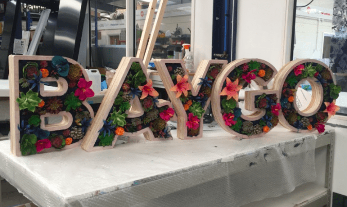
Modern materials and technologies heighten the effect and impact of these elements, such as these stunning signs of plywood and artificial floral arrangements for BAYGO restaurant in London. A single look at these is enough to think ‘fresh’ and ‘tropical’, without even knowing the Caribbean background of the business.
The retail calendar functions months in advance of everything, meaning you could be commissioning mass Christmas signage sometime in June. Don’t want to invest into cumbersome signage every month? No problem. Sometimes your best bet for refreshed and relevant signage is with reusable, temporary signage. Think of seasonal A-frame signs, banners, or sticky vinyl prints that can be installed in minutes, all of which can be peeled off or rolled up until the next relevant season.
Conclusion
Are you ready to harness the power of well-designed, integrated signage to boost your ROI?
Graffiti Design is a leading UK end-to-end sign-making business. We help you re-brand, design and manage your brand through the expertise of our team. Our customers included many high-street names as well as corporate and leisure businesses.
Get in contact today to speak to a team member or ask for a quote.
For more news and examples of our work, follow us on Instagram, Facebook or Twitter. Browse the rest of our wide range of products and services.

