Want to know more?
Please get in touch for more information about what we can do for you.
Contact Usrank-math domain was triggered too early. This is usually an indicator for some code in the plugin or theme running too early. Translations should be loaded at the init action or later. Please see Debugging in WordPress for more information. (This message was added in version 6.7.0.) in /var/www/vhosts/graffitidesign.co.uk/httpdocs/wp-includes/functions.php on line 6114Graffiti Design was asked by Wenzel’s the Bakers to update their brand design for three new stores in Brentford, Loughton, and Romford in Essex.
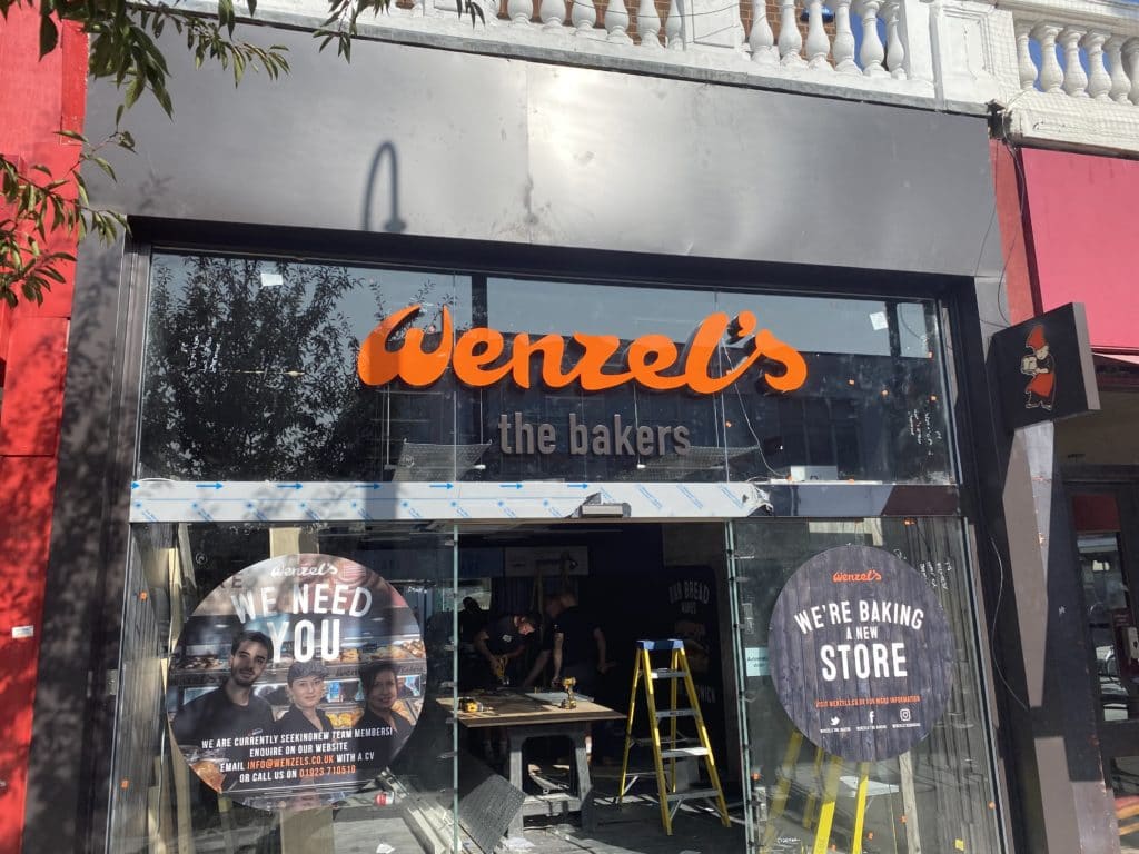
Graffiti Design was asked by Wenzel’s the Bakers to update their brand design for three new stores in Brentford, Loughton, and Romford, Essex. This involved surveying the sites, and manufacturing and installing all the external signage, together with internal signs and graphics. We were asked to incorporate a change of lettering style for the “Baker” text in the refreshed branding. We also needed to replace illuminated fascia panels with individual letters mounted direct to the glass.
Wenzel’s the Bakers is a community-based company which invests a lot of time and money into product development and training. Wenzel’s offers baking tours to schools and has a strong focus on future design and recognisable branding. For us at Graffiti Design, we have found it a privilege to work with a company with such a “can-do” attitude and a positive approach to business.
Wenzel’s the Bakers is a long-standing company, established in 1975 and developing a reputation as a favourite brand in north-west London. Now, with more than 60 stores and 500 employees, they have been expanding the brand eastwards into Essex, and expect soon to open an additional 20 shops. Wenzel’s are dedicated to baking quality goods for sale at affordable prices, and to outstanding customer service.
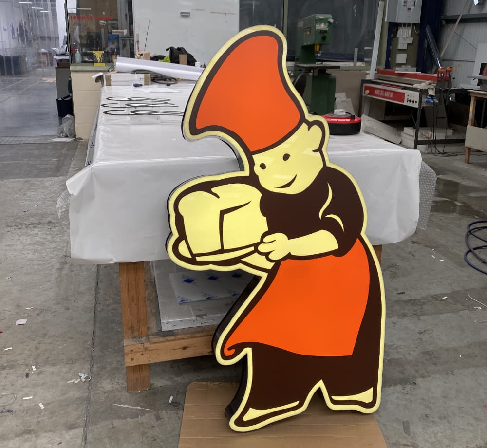
We made the LED-illuminated name “Wenzel’s” in a large, light-hearted flowing script to convey the pleasure of bakery. This was coloured in shades of orange and yellow, with the subscript “the bakers” in lower case upright lettering in a blue-grey colour to match the fascia. The large Wenzel’s brand icon is also coloured in orange, yellow, white and brown, reminiscent of baked bread.
For a further sign placed at right angles to the shop front, we made a smaller version of the Bakerman logo, placed between the orange script lettering “Wenzel’s” above, and yellow below for “The Bakers”, in matching script. The whole was mounted on black and illuminated with LEDs.
To carry out the project for Wenzel’s the Bakers, we chose a variety of materials, including aluminium, acrylic, digitally printed acrylic and LEDs. We selected these for their high visual impact, their low cost and their durability. We used a digital printer for all the window display graphics, while vinyl plotters supplied most of the internal lettering. Our CNC routers were employed to cut the faces of the glass-mounted “Wenzel’s” lettering, ready for building up into LED-illuminated 3D letters, and the Bakerman logo. The CNC pressbrake, guillotine and paint plant were heavily utilised in the production of the folded aluminium projecting signs.
The work took between two and three weeks, and we experienced no major challenges other than that of matching our manufacturing times with the client’s schedule.
Design
Manufacture
Survey
Installation
Router Cutting
Timber Fabrication
Vinyl Printing
Painting
Gilding


“It was with great pride and satisfaction that we handed over such a stunning looking project to a highly delighted client. Our sign-making team did another great job. We have now completed 37 sites for Wenzel’s the Bakers, all within the UK.”
James Gordon – Project Manager
Please get in touch for more information about what we can do for you.
Contact Us